How to Create Responsive Web Designs
Learn how to create responsive web designs with fluid grids, flexible images and CSS media queries so your site works well on phones, tablets and desktops.
Introduction
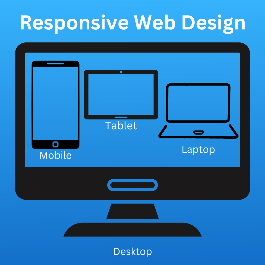
Responsive Web Design (RWD) ensures websites adapt seamlessly to different screen sizes,
providing a consistent user experience across mobile phones, tablets, and desktops. In
today’s multi-device world, RWD is crucial for offering a smooth, accessible site that adjusts
automatically to the device used. A responsive design improves user experience by making
navigation easier and content more readable, while also boosting SEO, as search engines
like Google prioritize mobile-friendly sites in rankings.
Key Benefits of Responsive Web Design:
- Enhanced user experience.
- Faster loading times.
- Improved search engine optimization (SEO).
- Reduced maintenance with a single design for all devices.
Techniques for Creating Responsive Web Designs
- Fluid Grid Layouts
A fluid grid layout utilizes scalable units like percentages rather than fixed measurements like pixels,
ensuring content adjusts proportionally to different screen sizes.
.container {
  width: 100%;
  max-width: 1200px;
  margin: 0 auto;
}
2.Flexible Images
Images and media must scale within their containing elements to prevent overflow. Using CSS properties like max-width: 100% ensures images resize based on the screen width.
img {
max-width: 100%;
height: auto;
 }
3.Media Queries
Media queries are a cornerstone of RWD. They allow you to apply different styles based on the device’s
characteristics, such as screen width or resolution.
@media (max-width: 768px) {
  body {
    font-size: 14px;
  }
}
4.Viewport Meta Tag
The viewport meta tag is essential for mobile-first design. It ensures the browser renders the page at the
correct scale.
<meta name="viewport" content="width=device-width, initial-scale=1.0">5. Responsive Typography
- Use relative units like em, rem, or percentages instead of fixed sizes
- Combine this with media queries for precise control.
body {
font-size: 16px;
 }
h1 {
font-size: 2rem;
 }
@media (max-width: 600px) {
body {
font-size: 14px;
}
h1 {
font-size: 1.5rem;
}
 }
6.Flexbox and CSS Grid
Modern layout techniques like Flexbox and CSS Grid offer powerful ways to create responsive designs:
Flexbox : Single-Dimensional Layout
Flexbox is ideal for arranging items either in a row or a column, offering flexible alignment
options.
.container {
display: flex;
flex-wrap: wrap;
gap: 10px;
} .
item {
flex: 1 1 30%;
 background-color: lightblue;
padding: 10px;
text-align: center;
}
This creates a responsive grid where items wrap to the next row when the screen is too narrow.
**CSS Grid :**Two-Dimensional Layout
CSS Grid is perfect for complex layouts involving rows and columns.
.container {
display: grid;
grid-template-columns: repeat(auto-fit, minmax(200px, 1fr));
gap: 10px;
}
 .item {
background-color: lightgreen;
padding: 10px;
 text-align: center;
}
This creates a responsive grid where columns automatically adjust based on the screen size, maintaining a minimum width of 200px.
7.Mobile-First Design
Designing for mobile-first means starting with the smallest screens and scaling up for larger devices. This approach prioritizes essential features and performance for mobile users.
/* Default for small screens */
body {
  font-size: 14px;
}
@media (min-width: 768px) {
  body {
    font-size: 16px;
  }
}
8.CSS Frameworks
Frameworks like Bootstrap and Tailwind CSS come with built-in responsive classes.
<div class="row">
  <div class="col-md-6 col-sm-12">Content</div>
  <div class="col-md-6 col-sm-12">Content</div>
</div>
Conclusion
Responsive web design is crucial for reaching your audience effectively, regardless of the device they use. By employing techniques like fluid grids, media queries, flexible images, and mobile-first design, you can create a website that’s not only functional but also visually appealing. Start small, test often, and always prioritize your users’ needs.